
Methods: Visual Design, Information Architecture, UI Design, Photography, Vector Illustration
Website: diamocoffee.com
THE CHALLENGE
Visibility in a Sea of Competition
Coffee and espresso makers are all over the place these days, and finding something that sets you apart is difficult. The product needed to show off it's unique branding from the shelves to the e-commerce world.
THE SOLUTION
A Luxury Experience Right At Home
Packaging Design that has a luxurious vibe, and highlights the product's features in multiple languages.
Website Design that has a lot of visual appetite appeal, explains how to use the product, and allows a customer to purchase it.
The Results
Packaging Design
I designed the packaging to showcase not only the machine, but also the coffee it produced in order to draw the eye of the consumer and visually communicate what the product did. I chose sleek fonts to emphasize the modern and luxurious qualities of the machine. I also created vector illustrations of the product in order to simplify the features and juxtapose from the product photography.
Layout and segmentation of the copy were both key focus points for the packaging, since the client expressed three different target markets: Canada, U.S., and Latin America. The columns on the back separate three languages: English, Spanish, and French.
Website Design
At the time of launch, the client was only selling one product, so the site needed to rely heavily on information and visuals in order to sell the product. Again, I wanted to draw out the luxurious qualities and add in a lot o appetite appeal to offset the information.
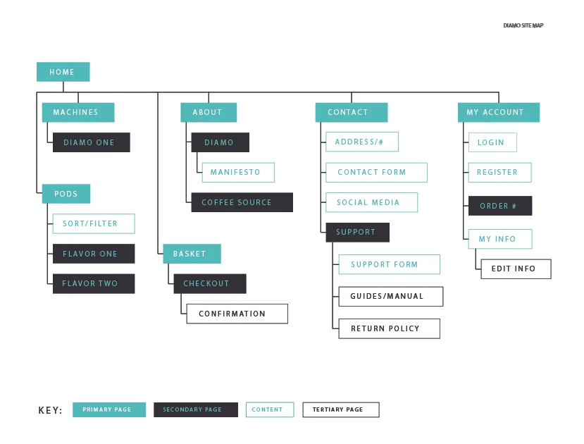
I started with a style guide in order to keep the brand experience consistent from the packaging to the website. I then created a site map to provide a better understanding of the site's flow and what content each page would include. From there I worked with a developer to build out the page figure out what kind of interactions would be possible within the project timeframe .
Final Thoughts
Given the opportunity to work with this project again, I would want to refresh the brand typography on the website in order to better match the packaging. I would also want to focus on the mobile experience and make more intentional decisions that the project's tight timeline and budget did not allow.
I would also love to further explore different packaging materials and textures in order to better differentiate from competitor products in the market.